Website Builder > Create Custom Component
Create Custom Component
Build custom editor components with React and register them with the Website Builder SDK.
- What editor components are and how they work
- How to create a React component that receives editor inputs
- How to register components with
createComponent()and input types - How to organize components into groups in the editor palette
Overview
Editor components are the building blocks that content editors use to compose pages in the Website Builder. An editor component combines a React component (your code, your styles) with a manifest that tells the editor what inputs to expose in the sidebar.
When editors drag a component onto the canvas, they’re interacting with your real React component—Webiny has no knowledge of your component’s implementation or styling.
Prerequisites
- Running Next.js starter kit (see Setup Next.js Project)
- Webiny Admin app accessible (locally via
yarn webiny watch adminor deployed CloudFront URL)
Component Anatomy
An editor component has two parts:
The React component — Your regular React code that renders UI. It receives editor-configured values via an inputs prop, typed with ComponentProps<YourInputs> from the SDK.
The manifest — Metadata that tells the editor about the component: its name, label, group, and what inputs (configurable props) it exposes to the editor sidebar.
You combine both using createComponent() from @webiny/website-builder-nextjs, then add the result to the editorComponents array that you pass to DocumentRenderer.
The editorComponents Array
The starter kit includes an editorComponents array in src/editorComponents/index.tsx:
Key points:
- The file is marked
"use client"— component registrations must run on the client because the SDK communicates with the editor via the browser. createComponent()takes the React component as its first argument and the manifest as the second.nameis a namespaced string — use a consistent convention like"YourNamespace/ComponentName". Component names are stored in page documents, so treat them as stable identifiers. Renaming a component breaks existing pages.inputsdefines the configurable props that appear in the editor sidebar. An empty array means no inputs.group(optional) links the component to a named component group in the editor palette.
Component Groups
Component groups organize the editor’s component palette into sections. They’re registered in src/contentSdk/groups.ts:
The filter option on the “custom” group is a catch-all: it collects any component that doesn’t have an explicit group set in its manifest.
Building a Custom Component
Let’s build a Banner component—a full-width colored strip with a headline and a call-to-action button link.
Create the React Component
Create src/editorComponents/Banner.tsx:
Always type your component with ComponentProps<YourInputs> from @webiny/website-builder-nextjs. Without it, TypeScript won’t know the shape of the inputs prop.
Register the Component
Add the Banner to src/editorComponents/index.tsx:
Test the Component
- In the Admin sidebar, navigate to Website Builder → Pages
- Open an existing page or create a new one
- In the component palette, look for the Custom group—your Banner component should be there
- Drag it onto the canvas
- Click the component to select it—the right sidebar will show the inputs: Headline, Button Label, and Button URL
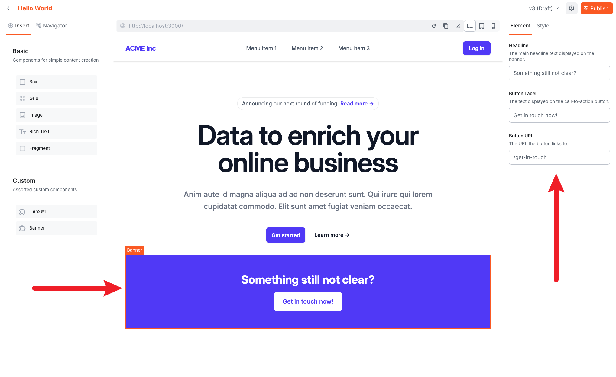 The Banner component selected in the editor showing the Headline, Button Label, and Button URL inputs filled in on the right sidebar
- Fill in the inputs and click Publish
- Visit your Next.js app and refresh the page to see the rendered banner
 The published page showing the Hero #1 component above and the Banner component below it
Input Types
The SDK exports a factory function for each input type:
| Function | Use case |
|---|---|
createTextInput | Single-line text, URLs, labels |
createLongTextInput | Multi-line text |
createNumberInput | Numeric values |
createBooleanInput | Toggle / checkbox |
createColorInput | Color picker |
createDateInput | Date / date-time picker |
createSelectInput | Dropdown with predefined options |
createRadioInput | Radio button group |
createTagsInput | List of tags |
createObjectInput | Nested object (group of sub-inputs) |
createLexicalInput | Rich text (Lexical editor) |
createFileInput | File / media picker |
createSlotInput | Slot for nesting other components |
Example: Select Input
To add a color theme selector to the Banner component:
Update the Banner component to use the colorTheme input: